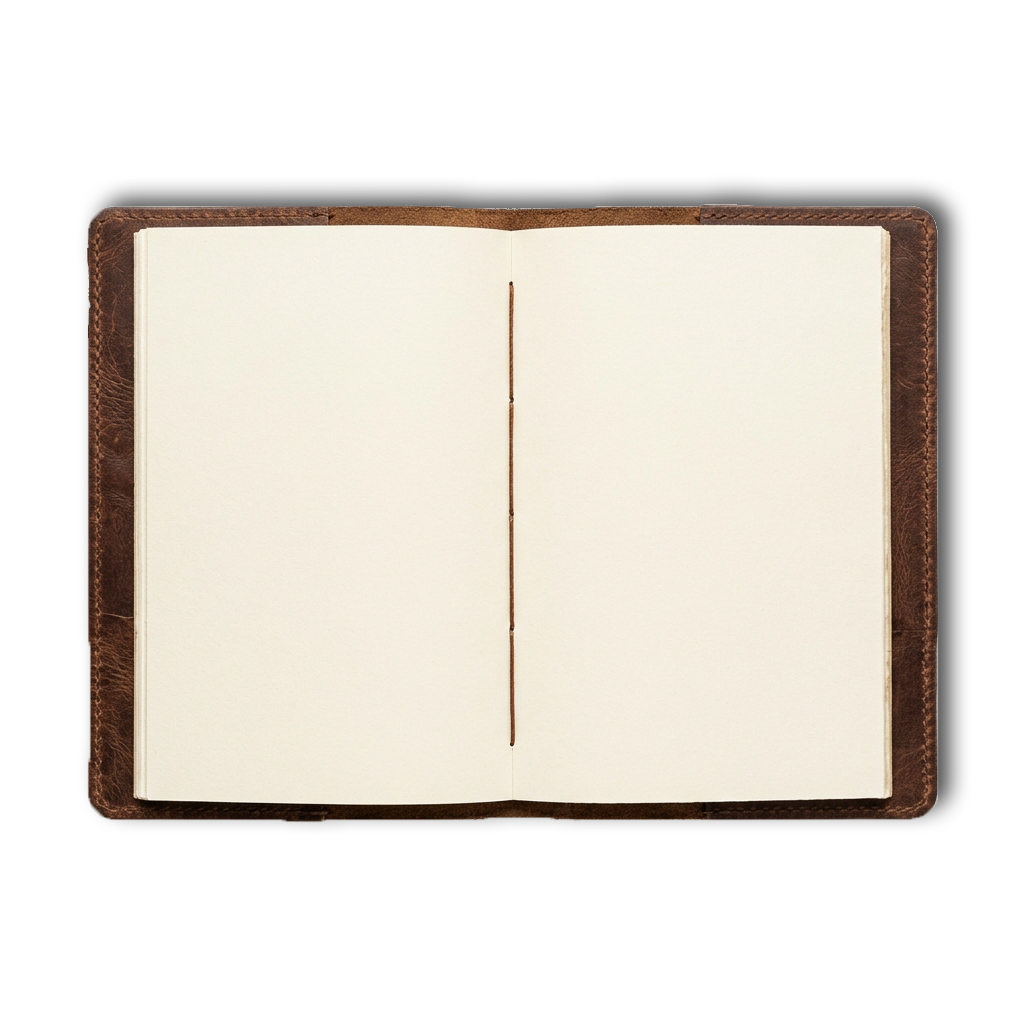



For over a decade, flat design has dominated our screens. In its quest for minimalism, the web stripped away textures, gradients, bevels, and shadows. While this clean aesthetics served the era of responsive layouts, it created a cognitive fatigue—an internet where everything looks uniform, interactive indicators are hidden, and pages feel like sterile glass screens.
But the human brain evolved in a physical, tactile world. We navigate space by reading light reflections, contours, and depth. This is where skeuomorphism holds its true strength. It bridges the gap between the virtual and the physical by providing immediate visual indicators.
Modern skeuomorphism (or "Neomorphism") is not about mindless clutter. It's about combining clean typography with premium tactile details. By using subtle CSS filters, double shadows (a light source highlight and dark shadow projection), and paper textures, we create digital layouts that feel premium, responsive, and alive.
"Good design is tactile. It invites you to touch, press, and explore, transforming pixels into physical materials."
As virtual and augmented realities (spatial computing) grow, the flat interface is no longer enough. We must bring back depth, shadows, and tactile logic, crafting digital environments that respect physical principles.